Monday, April 4, 2016

Favorite Logos


1. My favorite logo is the Disney logo. I think it is well designed because it is so unique that it is almost like its own font that is only related to Disney. I think its very memorable because of the style, and the way there is a mix of capital and lowercase letters. Also, the logo is very versatile because the filling of the letters is often changed to fit the situation it is being associated with.

2. 50 Best Logos of 2015 - 16
 I like this design because its a single letter but the letter is elaborate and I like that style. I also like the limited amount of color.
50 Best Logos of 2015 - 39


I like this one because the logo is an untraditional making of the word. I like the way the image is a simplistic outline of the blue fish.
Milky Mug
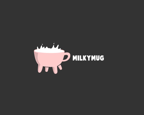
I like the way the logo is a literal representation of the words and is playful.
Twins
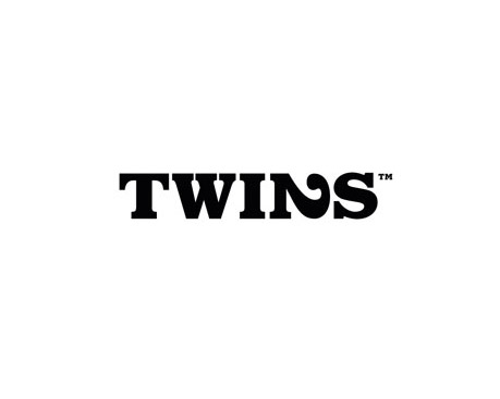
I really like the way the 2 is itself as well as the N of the word. I like when logos have the words intertwined like that.

I like the Barbie logo because it is so well known but simple and embodies the product well since it is very girly like the dolls.

Tuesday, March 22, 2016

Poster Reflection


1. I think the stand within my poster is fairly clear. The text of my poster is straight forward and the message is clearly that all body types are fine, not just super skinny bodies. I think it also shows my stance through the varying body types of the people in the poster and the various colors adds to the variety of people. 

2. I was not successful in re-creating my thumbnail. My original idea was more complicated and I would not be able to just trace a pre-made image.  I am okay with my new outcome but, I would have preferred to be able to create my thumbnail because I feel like the message would have been stronger. 

3. I removed the words form within the figure like I had it in my first version of the poster. I also made the figures larger and varied the colors. I also broke up the background into more pieces. I made changes with Ms. Lee's advice to make the decisions about color and font and space more meaningful and thoughtful. 

4. I think my project is strongest in the concept category because my images and the text are very explicitly related to my concept and what I'm trying to express. I feel least confident in the skill and technique category because I don't think I did extremely well with the tools and it was difficult for me. 

5. Conceptually, the most challenging aspect of the project was figuring out a slogan that was simple but also easy to understand and could effectively communicate an idea. It was also difficult because the text had to be something catchy and memorable which was difficult because many quotes were too long or too vague and not related to what I was trying to communicate.


5. Technically, it was difficult to trace the images and make them look realistic and how I wanted them. It was hard for me to manipulate the figures once I traced them because it was difficult to fill them in and change the colors.  It was also very difficult for me to draw in illustrator because the lines become shaky and not straight.


Wednesday, January 20, 2016

My Topic

Recently, on my Facebook and Instagram I've seen a lot of people sharing a video that a classmate of mine from middle school made a video about catcalling and young girls. The video and the topic overall has caught my attention because I know what its like since it happens to me often. I've also seen a video of an artist who wore a camera and walked around and documented all the comments and confrontations she had during an entire day. I've also seen a buzzfeed video where women wore cameras and their significant others saw the video and feared for their safety. I strongly agree that this is an issue because it happens to the majority of women in any place and at any time. It makes women uncomfortable and sexualizes them for things that they wear or how they look, as if women don't have the right to do wear what they want. Men sometimes argue that they are just trying to give women compliments and they shouldn't be made to seem evil for that. However, a compliment is much different then the catcalling that is constant and goes on.

Another issue that I have seen on my social media sites is body image. In the media, there is a very specific idea of what the correct body is and this is very limiting to what could be seen as "beautiful" in media. The media's depiction of what the right body is leads to issues with many young people. Girls may feel too fat or not good enough because they don't feel like they match the image in the pictures they see on tv or in a magazine. This could lead to anorexia, bulimia, and risky surgeries. All of which could be detrimental to a person's health. This also goes for boys who feel like they need to fit the images they see and decide to do things such as take steroids.

http://www.westminstercollege.edu/myriad/index.cfm?parent=...&detail=4475&content=4795
http://www.mirror-mirror.org/the-media-and-body-image.htm