1. My favorite logo is the Disney logo. I think it is well designed because it is so unique that it is almost like its own font that is only related to Disney. I think its very memorable because of the style, and the way there is a mix of capital and lowercase letters. Also, the logo is very versatile because the filling of the letters is often changed to fit the situation it is being associated with.
2.

I like this design because its a single letter but the letter is elaborate and I like that style. I also like the limited amount of color.
I like this one because the logo is an untraditional making of the word. I like the way the image is a simplistic outline of the blue fish.
I like the way the logo is a literal representation of the words and is playful.
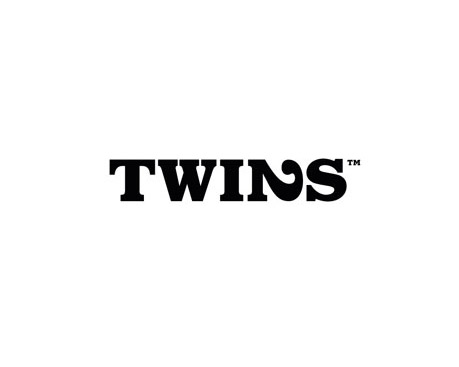
I really like the way the 2 is itself as well as the N of the word. I like when logos have the words intertwined like that.
I like the Barbie logo because it is so well known but simple and embodies the product well since it is very girly like the dolls.
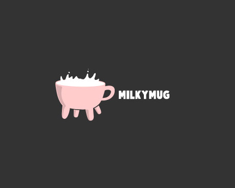
I LOVE THE MILKY MUG LOGO. It is super cute. I notice that you like simple logos, very similar to my taste. I feel like logos that have too much going on is very overwhelming and takes too much work to figure out what the logo is about.
ReplyDeleteI like the milky mug logo because it made me salivate.
ReplyDeleteI really like the disney logo because of the different font and I notice you tend to like logos with interesting fonts
ReplyDeleteI notice that you like all types of logo designs. From decorative to san serif and serifs. (Disney, Bluefish, and Milky Mug are all different)
ReplyDelete